Strong visuals, lacking proof
A visually polished homepage that clearly communicates the product, but the page still hides social proof and accessibility signals, leaving trust and mobile polish as the weak links.
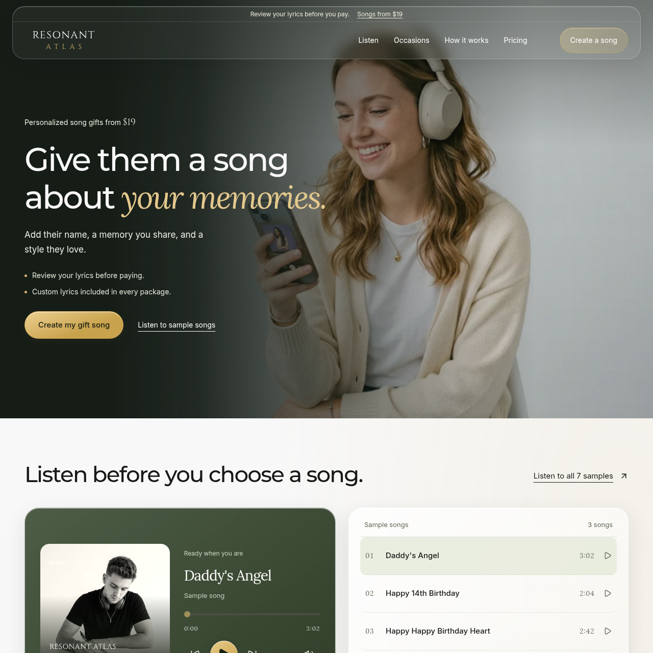
First impression: you've got a hero that looks like a premium ad and a navigation pill that says, 'Yes, we know we're fancy, don't @ me.' The big headline dominates the left side with a bold white typeface, and a gold script accent-nice touch, but the left-leaning gradient on the hero can smother copy at certain breakpoints. The top bar is sleek, the rounded gold CTA in the header feels earned, and the hero actually delivers on the promise (song gifts from $19) without lying to you about unicorns. Below the fold, the Listen section reads like a real product: two-column playback + list, with chunky rounded cards that say, 'Yes, we used rounded corners on purpose and you will click them.' It's modern enough to fool your grandma into thinking you're not a disaster of a designer. The colors stay cohesive-dark greens, creams, and that honey-gold CTA that behaves like a treat on a cheat day. Progress note: it's easy to navigate, the journey from listen to choose to pay feels logical, and the cards breathe with generous whitespace.
But let's talk about the elephant in the studio: trust signals. I don't see testimonials, logos, or any proof that people actually got their songs delivered on time, or that the reviews aren't sponsored by the company's own marketing team. You tout 'Review your lyrics before paying' and 'Custom lyrics included,' which is great-until I realize there's no social proof to back it up. The footer and security cues are conspicuously absent, which makes the checkout feel like a leap of faith rather than a confident purchase. Accessibility also feels like an afterthought: no obvious contrast checks visible from the screenshot, and I can't confirm alt text on imagery or keyboard navigation cues. The hero has a clean vibe, but mobile rhythm and micro-interactions look undercooked in the current view, and that's where the real floor drops happen for performance.
Overall, you've improved the hero presence and CTA visibility, but you're still selling a premium product without selling trust. Put a few testimonials, a couple of delivery stats, and some obvious accessibility polish in there, and you'll finally stop looking like a pretty brochure and start feeling like a reliable service.
Updated your site? See if your score went up.
Re-roast www.resonantatlas.com to track your progress over time, or roast any other site.
Re-roast This Site Roast a different site →