Polished UI, Content Overlaid
Nice card-driven design and a charming Animal Crossing vibe, but a gatekeeper popup and readability friction dull the conversion shine.
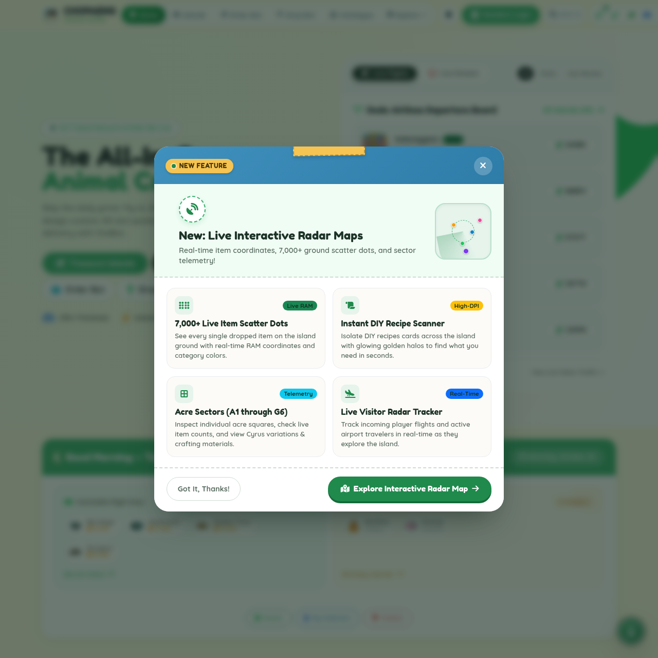
First impression: that modal is the star of the show and the hero content is left squinting in the wings. A bold blue header, a 'NEW FEATURE' badge, tape-bit flourish, and a big, centered panel make you feel like you're in a fancy demo trailer - while the page behind it sighs at the distraction. The backdrop is soft and friendly (cream/beige with rounded white cards), which would normally feel calm, if not for the opera of green CTAs and pastel badges fighting for your attention inside the popup.
The copy and UI inside the modal are actually pretty on-brand: pastel tiles, tiny green/blue/yellow pills labeling features, and a big green CTA that says Explore Interactive Radar Map. It's cute, it's cohesive, and it nicely communicates the feature cluster. But the practical effect is a content hijack: you can't help but close the popup and scroll the page, which mutters, 'nice product, now let me actually read your content.' The rest of the page is a friendly, card-based stroll through islands, 24/7 nets, and Patreon perks, which is charming until you're forced to dismiss a modal before you've even decided if you want to subscribe.
Bottom line: the design and copy are strong, the concept lands, but the UX needs a lighter touch on gating and a bit more trust-building to stop the popup from sabotaging the very conversions it's trying to drive.
Updated your site? See if your score went up.
Re-roast www.chopaeng.com to track your progress over time, or roast any other site.
Re-roast This Site Roast a different site →