Polished, but safe
A well-executed, confident design with clear value props and solid trust signals, but a few typography, rhythm, and content-density tweaks would push it into standout territory.
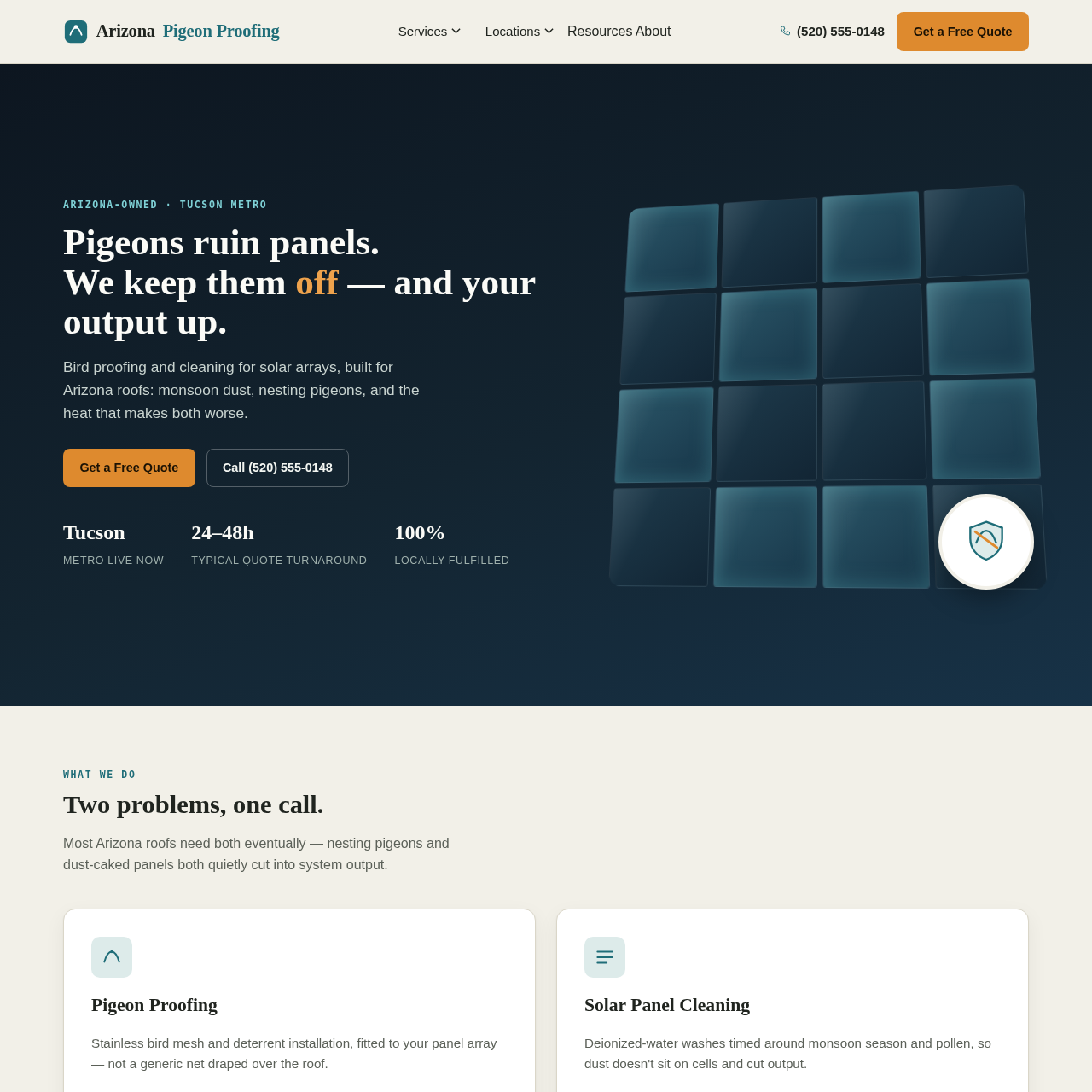
Arizona Pigeon Proofing shows up like a well-groomed HVAC tech who also has a flair for serif headlines. The hero duel-text on the left, moody gradient on the right with a tidy grid motif-reads as confident and modern, and the orange Get a Free Quote button is deliciously punchy. But then we hit the rest of the page: sections are clean, cards are friendly, and testimonials exist like tiny trophies on a shelf. It's all very respectable-almost to a fault. It feels safe enough to trust, yet a bit too content with itself: the hero typography leans into a heavy, serif hero that fights for attention but occasionally breaks line breaks in awkward places, like a designer who forgot to test responsive wrap. The city list under Where we work is charming but visually busy-pills everywhere, which is fine until you scroll and lose track of what's most important. And while the trust signals (Google reviews, local focus) are genuine, the overall journey could use a louder, more daring CTA path to prevent users from gliding past without booking a quote. In short: it's a handsome tool, but it wouldn't upset Gordon Ramsay to hear it could use a pinch more zing and a dash less busywork.
Updated your site? See if your score went up.
Re-roast www.arizonapigeonproofing.com to track your progress over time, or roast any other site.
Re-roast This Site Roast a different site →